Color Me Accessible: ZDOS® Gets a New Color Palette
The data visualizations within the Zartico Destination Operating System® (ZDOS®) are getting a facelift for 2024. A brand new color palette is rolling out to the platform soon, and it’s designed to be not only beautiful, but also accessible.
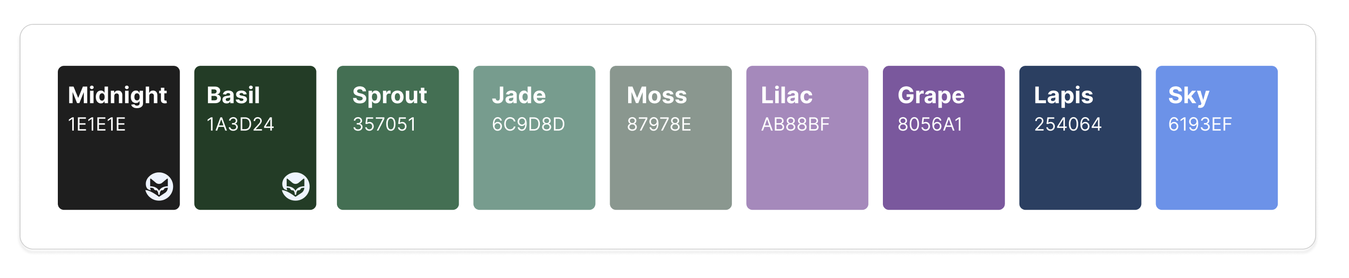
“As technology comes into more places in our lives, the diversity of people who use technology keeps increasing,” says Abs King, UX + UI Architect at Zartico. “It's really important to us that everyone has the best experience with our product and the clearest understanding of what they’re seeing — and that extends to the way we use colors within the ZDOS® platform.”
The new colors were chosen to complement Zartico’s brand colors while also meeting international standards for contrast and differentiation.
Contrast ratios measure how distinguishable a color is from a white background, ensuring individuals with low vision can see and discern the colors. All of the colors in the new palette meet or exceed the international standard of 3:1 contrast.
The product design team also analyzed the colors through filters that mimic different forms of color vision. Colorblindness is thought to affect more than 300 million people worldwide, with two types of red-green colorblindness being the most common.
Using these filters allowed the team to confirm that the colors would be easily distinguishable from one another — which is vital when graphs layer colors to display more than one level of information.
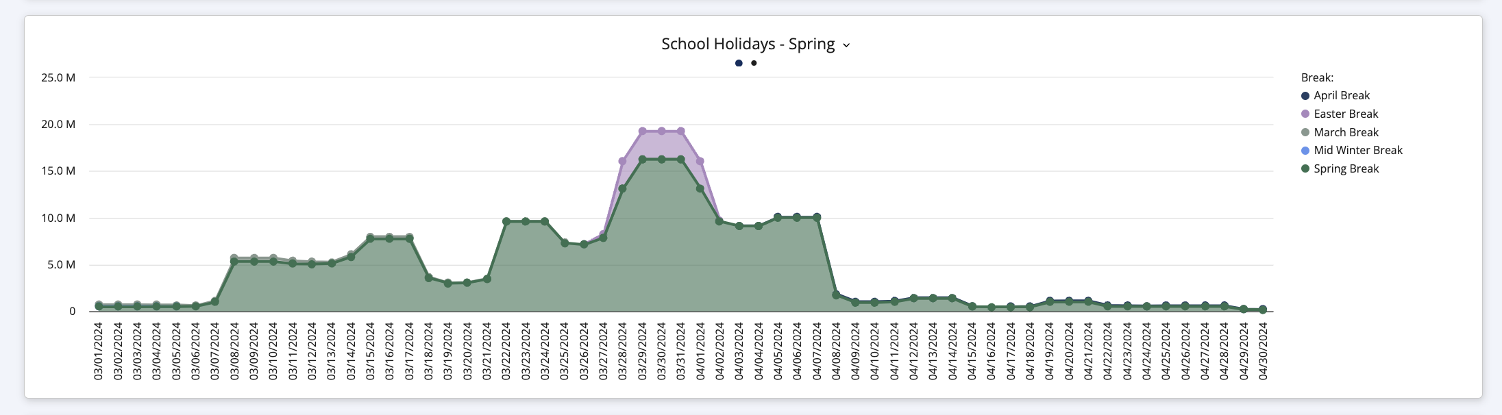
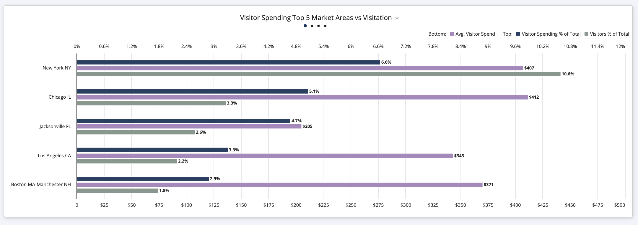
The resulting color palette will be applied to all of the data visualizations within ZDOS®, from bar charts and area charts to heat maps and bubble charts.
ZDOS® visualizes data from multiple sources, putting insights in context to tell the full story of the place-based economy. Learn more about Zartico’s Integrated Data Model.